Visualisations in Python
Creating visualisations can require a lot of effort.
See Matplotlib Examples Gallery:
There are many Python packages that provide different features in order to create all kinds of plots. We will present one of the most commonly used packages in this guide: Matplotlib.
Basic plots
Using Matplotlib you can plot all kinds of charts such as histograms, barplots, scatterplots, pie charts etc. For example, if we import the matplotlib module:
from matplotlib import pyplot as plt

plt.plot(df['My value 1'], df['My value 2']) # this will produce a basic line chart for two selected columns from dataframe df
plt.show() # this command is required to display the plot
Using the famous iris dataset we can produce a scatter plot of the sepal length and the sepal width: We load the Seaborn package to import the iris dataset:
from matplotlib import pyplot as plt
import seaborn as sns

# View a list of pre-loaded Seaborn datasets
for dataset in sns.get_dataset_names():
    print(dataset)

df = sns.load_dataset("iris") # we import iris data
print(df.head(3)) # view first 3 rows of the data

# Create a scatter plot
plt.scatter(df['sepal_length'], df['sepal_width'], color='green', marker='s')
plt.xlabel('Sepal length') # x axis title/label
plt.ylabel('Sepal width') # y axis title/label
plt.show()
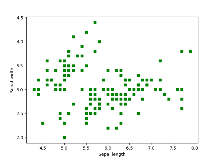
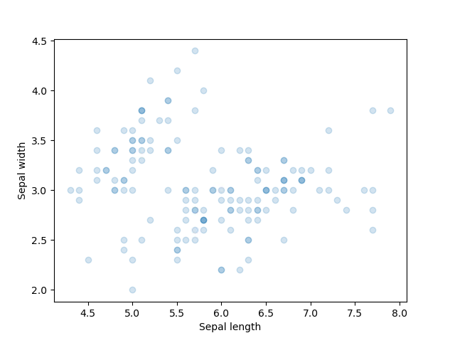
Notice how we set the colour of the data points (color parameter) and the shape (marker parameter = square). To edit the transparency degree (alpha parameter) of the points:
# Edit data points transparency with the parameter alpha
plt.scatter(df['sepal_length'], df['sepal_width'], alpha=0.2)
plt.xlabel('Sepal length')
plt.ylabel('Sepal width')
plt.show()
Applications
Using the Smoking, Drinking and Drug Use among Young People in England 2018 [NS] plots displayed on the webpage, we attempt to recreate them using Matplotlib. To create the first plot (line chart):
Plot 1 - Pupils who have ever smoked, by year [Line chart]
import pandas as pd
import numpy as np
from matplotlib import pyplot as plt
import seaborn as sns

path_1 = "python\data\csv_v1.csv" # load the dummy data csv we created
df1 = pd.read_csv(path_1) # Create a Pandas dataframe
After loading our Python packages and dummy data we can start working on producing the first plot:
# Create a line chart (Plot 1)
plt.figure(figsize=(10, 5)) # set the figure size
plt.plot(df1['Year'], df1['Percent'], label="Sepal", linewidth=2, linestyle='-') # create the plot

# Define labels and ticks
plt.ylabel("Percent", loc='top', rotation="horizontal") # y label title and location
plt.xticks(np.arange(1982, 2020, step=2)) # x axis ticks range
plt.yticks(np.arange(0, 70, step=10)) # y axis ticks range
plt.grid(axis='y') # opting for y axis gridlines

# Create annotations (done here for one annotation to avoid redundancy)
plt.annotate('Jan 2003: Large new health warnings on cigarette packs', xy=(2003, 42), xytext=(2003, 52), size=9,
                                                                        bbox=dict(boxstyle="square", fc='0.95', pad=1, ec="none"),
                                                                        arrowprops=dict(facecolor='black', shrink=0.05, width=0.5, headwidth=6))
plt.box(False) # remove outer borders
plt.savefig('SDD_YP_England_2018_plot1.pdf', bbox_inches='tight') # save plot as .pdf file
plt.savefig('SDD_YP_England_2018_plot1.png', bbox_inches='tight') # save as .png
plt.savefig('SDD_YP_England_2018_plot1.svg', bbox_inches='tight') # save as .svg
Notice how plt.show() which displays the plot is not included in this code as it's not necessary as we are saving our plots with the plt.savefig() function. The three plots will be saved in the local folder your code is also stored or in a folder of your choice. Presenting the .svg image:

The advantages of a .svg file compared to using a .png file is better outlined through reading Benefits of using SVG (scalable vector graphics).
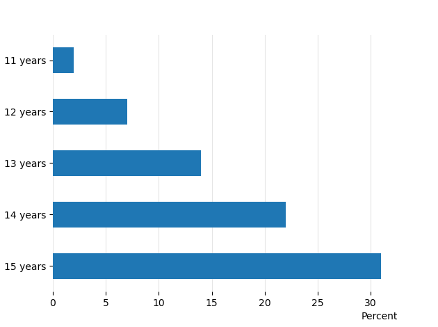
Plot 3 - Pupils who have ever smoked, by age [Horizontal bar chart]
Similarly, to create the third plot (horizontal bar chart) on the publication webpage:
# Create the Pandas dataframe
percent_y = [2, 7, 14, 22, 31]
index = ['11 years', '12 years', '13 years', '14 years', '15 years']
df = pd.DataFrame({'Percent': percent_y}, index = index)

# Plot the horizontal bar chart
ax = df.plot.barh() # plot the chart
ax.invert_yaxis() # invert the y axis
plt.xlabel("Percent", loc='right', rotation="horizontal") # place the x label
ax.get_legend().remove() # remove the unnecessary legend
ax.set_axisbelow(True)
ax.grid(color='gray', which='major', axis='x', linestyle='-', alpha=0.2) # last 2 commands create and style the x axis gridlines
plt.box(False) # remove plot borders
plt.show()
In this case we opted to display the chart, if you wish to save it then plt.savefig() function should be added at the end of the code.
Visualisations and accessibility
From the Government Analysis Function policy on data visualisation charts.
Accessibility legislation came into force in September 2020. This means all content published on public sector websites must meet the level A and AA success criterion in the Web Content Accessibility Guidelines 2.1.
This includes charts.
Content on public sector websites that does not meet the Web Content Accessibility Guidelines 2.1 can get complaints related to the Public Sector Bodies (Websites and Mobile Applications) Accessibility Regulations 2018 and/or the Equality Act 2010. This could cause reputational damage and loss of public trust.
Make sure whoever is responsible for the content you publish is aware of this and the possible risks involved.
More info on data visualisations standards
Further reading
- An Intuitive Guide to Data Visualisation in Python
- Top 6 Python Libraries for Visualisation
- Matplotlib Examples gallery
- Matplotlib functions summary
External Links Disclaimer
NHS England makes every effort to ensure that external links are accurate, up to date and relevant, however we cannot take responsibility for pages maintained by external providers.
NHS England is not affiliated with any of the websites or companies in the links to external websites.
If you come across any external links that do not work, we would be grateful if you could report them by raising an issue on our RAP Community of Practice GitHub.